Daily Updates: Jan 9
Design Spotlight is a curated database of design cases, showcasing daily updates from various design studios and agencies. Here are the updates from Jan 9.
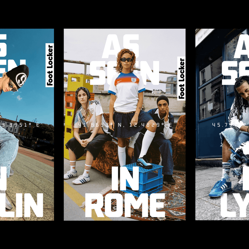
Regional Brand Identity And Design System For Foot Locker
AKQA partnered with Foot Locker to evolve The Heart of Sneakers into a flexible design system for EMEA that unites global consistency with local expression. The team created a regional brand identity inspired by cities and communities, enabling grassroots narratives and giving cultural ownership to fans. The system connects North America and EMEA, providing a scalable foundation for campaigns and seasons while allowing each market to shape its own voice. The approach extended to the FLX membership program, aligning it with the new identity. The outcome strengthened brand equity, deepened cultural relevance, and lifted proud-to-own and local relevance metrics. The work offers a blueprint for brands seeking to balance unified standards with hyperlocal authenticity.
Brand Refresh For A Multi-tenant Office Building In Amsterdam
Analogue brings new life into The 1, a vibrant rental space in Amsterdam. Located at NDSM and spanning 28,800 sq.m., this multi-tenant office building is positioned to redefine workspaces in the city. Analogue revitalized the building’s presence to reflect its scale, energy, and ambition, supporting its role as a flexible destination for diverse tenants. The outcome presents The 1 as a contemporary hub within the NDSM district and communicates its offer as a forward-looking place to work and grow.
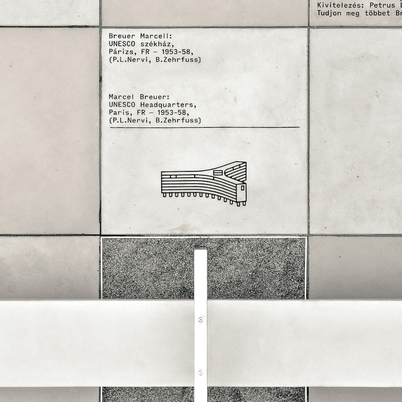
Breuer Marcell Walkway by Classmate
Interpretive Graphics For Bivak Studio
Classmate Studio contributed to Bivak Studio’s memorial concept honoring Marcel Breuer and his Bauhaus-era work. The studio developed a minimalist yet distinctive system of illustrations depicting Breuer’s iconic industrial and architectural pieces. Paired with monospaced typography, the graphics are sequenced along the walkway in an abstract, Bauhaus-inspired composition that guides visitors toward the memorial’s centerpiece, a bench. The installation encourages passersby to pause, learn about Breuer’s legacy, and reflect within the industrial rhythm of the path. The project was realized with Bivak Studio (architectural concept), MDRS2 Kft (structure), and Réka Tóth (landscape), with photography by YANEP LUST Collective and close-ups by Bernáth Milán.
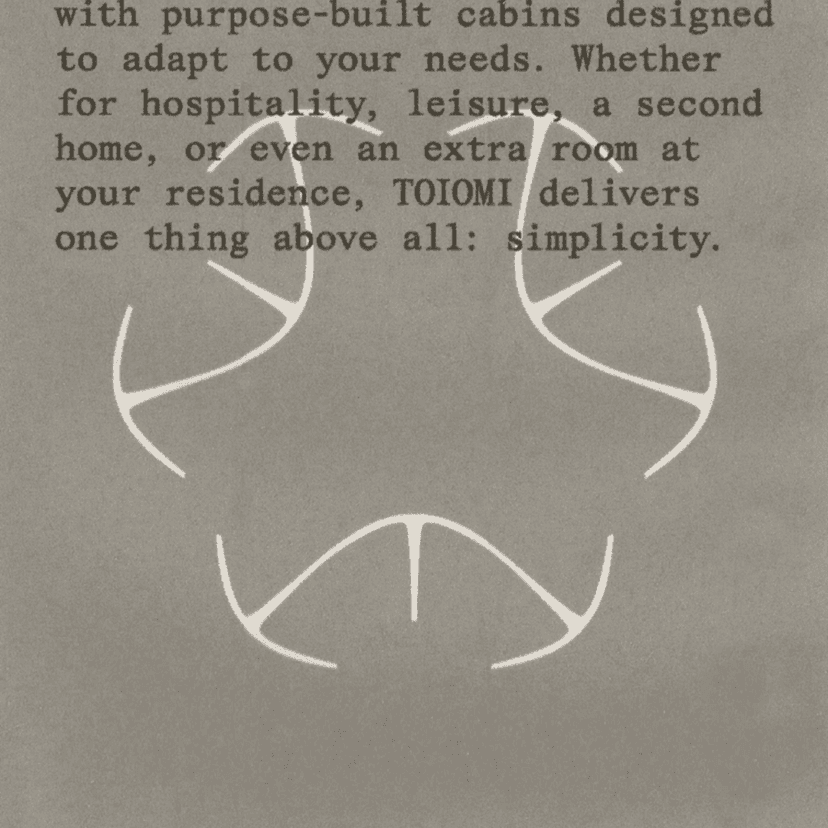
Brand Identity For Toiomi
Astrae Studio developed a refined brand identity for TOIOMI, focusing on a modern and elevated aesthetic that reflects the brand’s contemporary sensibility. The design emphasizes clarity, balance, and a sense of understated sophistication across all touchpoints.

Frank Lloyd Wright Building Conservancy by Order Design
Visual Identity System For An Architecture Preservation Nonprofit
Order created a comprehensive visual identity for Frank Lloyd Wright Building Conservancy, the nonprofit dedicated to preserving Wright’s remaining buildings. Drawing on Wright’s red square signature, Order built a modular symbol and wordmark that form a flexible toolkit and visualize the impact of a single lost building. A tailored color palette evokes the materials and light of Wright’s spaces. Typography centers on a customized version of Reply, referencing Wright’s favored typewritten Vogue Intertype, with geometric forms extended into a broader graphic language. The system includes an illustration approach inspired by Froebel blocks to adapt to individual structures, and an adapted marque for SaveWright, the organization’s magazine, highlighting the “missing” square. Order delivered comprehensive guidelines to help the Conservancy implement and expand the system across future applications.
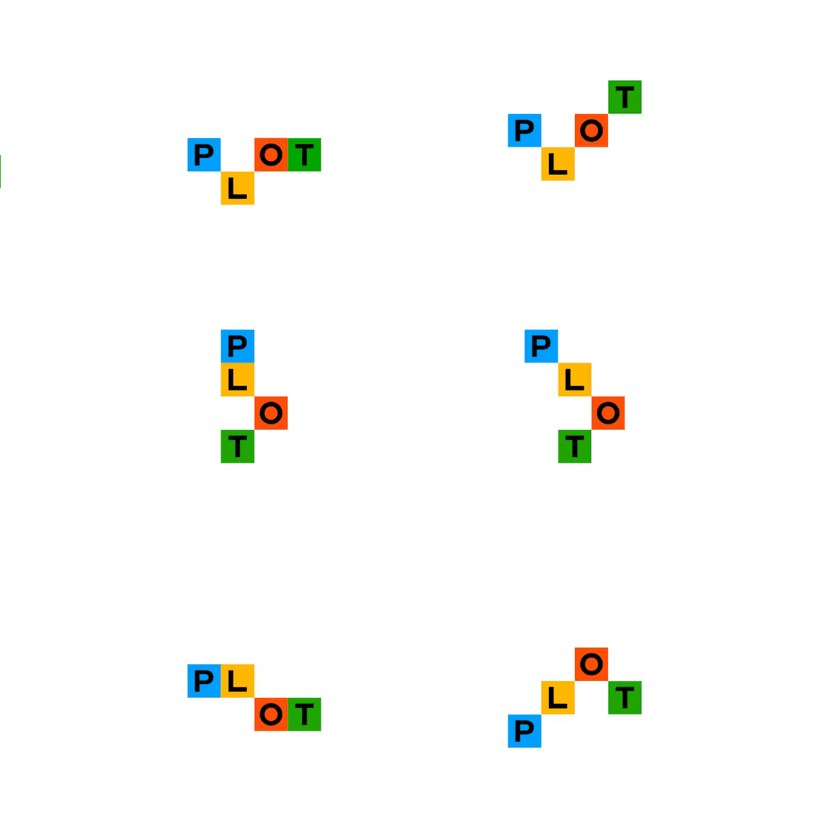
Plot by Order Design
Visual Identity And Website For A New York Real Estate Advisory Group
Order developed a flexible brand system for Plot, a New York real estate advisory group serving artists, designers, musicians, and performers. The identity centers on an ever-changing wordmark that reflects the dual technical and creative meanings of plot and adapts to different applications. A single weight of Circular, designed by Laurenz Brunner for Lineto, provides typographic consistency. Black-and-white photography grounds a playful color palette and keeps focus on the creative partners featured in promotional materials. On the website, duotone imagery enlivens hover states, extending the graphic language into digital touchpoints. The system scales across collateral and communications while keeping artists’ practices and stories at the forefront.