Daily Updates: Nov 19
Design Spotlight is a curated database of design cases, showcasing daily updates from various design studios and agencies. Here are the updates from Nov 19.
Brand Strategy And Visual Identity For A Digital Fashion Brand
Studio NARI partnered with Blueberry, a digital fashion brand spanning gaming, socials and IRL, to reposition it from techy-gaming and overly youthful cues to a category-leading pioneer. The team established Dare to Be as the strategic platform, a call to action expressing limitless self-expression and ambition. This platform informed a flexible brand world: avatar personas representing distinct psychographic profiles, art direction that blurs real environments with in‑game scenes, and a system wired for evolution. A tonal purple palette led by Vivid Blueberry, augmented and responsive logotype and marque with glitch and motion, and a morphing pattern system embed surprise-and-delight easter eggs. Scope covered brand strategy, visual identity, art direction, tone of voice, avatar personas and web design, positioning Blueberry to lead digital fashion’s next wave.
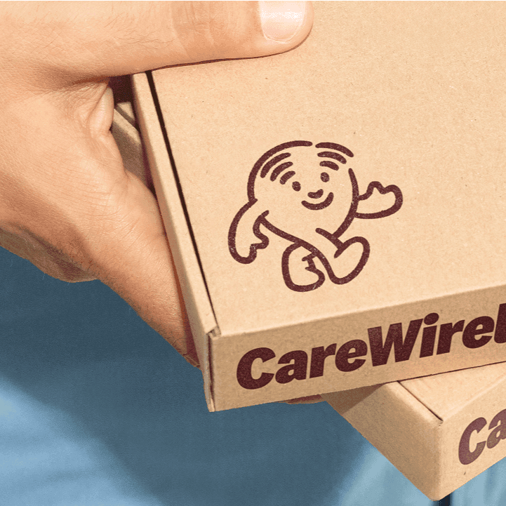
Brand Identity For Care Wireless
Classmate Studio created a new brand identity for Care Wireless to make the Affordable Connectivity Program feel human and approachable. The system centers on a friendly emblem-mascot that serves as a caring guide, embodying connection in both form and spirit. A light palette of trustworthy blues and optimistic orange, paired with modern typography, communicates community, clarity, and warmth while avoiding the sterile look of large telecoms. The result is a clear, optimistic identity that helps users navigate with ease and reflects the client’s mission: not just providing connectivity, but delivering care.
Brand Identity, Interface, And Strategy For Companies
Family Office, founded by Diego Segura, creates brand identities, crafts user interfaces, and writes company‑defining essays, manifestos, and brand strategy. The studio positions itself as both a design and writing partner, shaping how organizations present themselves and articulate their beliefs. Work spans digital interfaces and long‑form strategic writing that clarifies mission and direction.
Dunkin Munchkin Holiday by Buck
Integrated Holiday Campaign For Dunkin'
Buck partnered with Dunkin’ and Artists Equity on a cohesive holiday campaign spanning packaging, publishing, and animation. The team developed storybook-inspired packaging for nearly a billion cups and boxes, designing each surface—transparent cold cups and cottage-like carry boxes—to host playful vignettes of MUNCHKINS characters sledding through orders. Building on that world, Buck translated the 2D illustrations into expressive 3D characters for a hero film, voiced by Mindy Kaling, bringing a derpy, delicious cast to life. The narrative extended into a children’s book, tying every touchpoint together under one festive theme. From art direction and character development to 2D/3D animation and editorial, Buck orchestrated an integrated system that made the holiday story feel consistent, charming, and scalable across retail and media.
Case Study For Brisca
Onmi Design presents a case for Brisca. The available content only provides the page title and a general studio description, so specific project objectives, scope, and outcomes are not detailed. Onmi Design is an award-winning studio focused on brand identity, strategy, communication, and packaging, and this project likely relates to those capabilities for Brisca.
Brand Identity For A Leading Hr Award
hh.ru commissioned a new identity for HR Brand Award, the leading competition in the Russian HR industry. The concept positions the award as the “Oscar” of the HR world, blending theatrical mystery and celebration. A refined, star-shaped logo expresses attraction—bringing professionals together—while preserving continuity and adopting a more minimal, contemporary form. The 2024 key visual is a flowing curtain that echoes the mark’s petal-like contours. Dynamic motion graphics, lighting, and animated icons heightened the spectacle on stage and across screens. Premium printed materials—envelopes, bags, and invitations—extended the system. A new trophy, cast in clear epoxy with a brass emblem, symbolizes light, recognition, and the energy of the HR community.
Calm Sleep Visual System by Buck
Cohesive Brand Visual System For Calm Sleep
Buck partnered with Calm to create the company’s first cohesive brand visual system, pioneered within the Calm Sleep product. The system was designed to enrich the app’s messages and user experience with a voice that flexes from metaphorical to literal use cases. Buck crafted elements such as ethereal lighting behaviors, characters in motion, and story-framing gradients to form a visual language that balances poetic wonder with practical clarity. The process began by defining how Calm Sleep should feel and the stories it should tell, followed by ideation and sketching to weave metaphor without losing clarity. Gradient and light then came together to bring the system to life, culminating in a sizzle reel that showcases the worlds built for the product.


